A GDL object usually has many parameters. These parameters exist to be set by the user.
Making user interactions more comfortable is one of the main principles of product design nowadays, so it is highly recommended to give your objects a nice, graphical user interface in addition to (or more like, instead of) the simple parameter list provided by default in ARCHICAD. The user interface must be clear: the user have to know exactly what options are available with the current parameter settings, so always hide or lock unnecessary/dormant parameters (See the Parameter Logic section for details).
The area you can working with is located on one of the tabs of the Settings Dialog:

GDL provides a lot of customizable control types, and some predefined popup buttons for special parameters (surface, pen, fill, line type, boolean parameters). The control types usually look and behave the same as on the program’s interface.
There is a slight difference between the 2 operation systems in displaying the controls and texts.
OS X (10.9.5)
:

Windows 8:

The size of the custom user interface is fixed: 444 x 266 pixels ( see the red rectangle on the above pictures).
If you are developing a Library Global object for the Model View Options dialog, the width should be 600 pixels, and the height can be set as needed.
The elements are positioned using a coordinate system, but the positive y axis goes to the south this time. The (0, 0) point is the top left corner of the red rectangle.
Position coordinates are defined in pixels (integer types).
The frame-system of the UI

The picture shows the User Interface script window of an example object in the GDL editor.
Options and buttons:
- Set as Default: if this option is set, and the object has a ui script, the graphical ui is going to be the default view when the object is opened in the Settings Dialog. If it’s not set, the All Parameters list will appear by default.
- Hierarchical pages: set it ON to get ARCHICAD’s automatic tabpage control popup function.
- Check script: same as in other scripts, checks for syntax errors and warnings.
- Preview: a button for preview window, an extra option to check for layout warnings (overlapping items, out of page bounds warnings)
To set the title for the UI area, use the UI_DIALOG command:
ui_dialog `Dialog Title Here`
If you only plan one tabpage, you can fill up the content after this command.
However, since the size of the UI area is quite small, usually more tabpages are necessary to display the whole function/parameter palette of the object. To display the tabpage structure, and to move between pages, the easiest way is to use ARCHICAD’s built-in function (Hierarchical pages). It is not yet supported in Curtain Wall elements, Labels and Zones, but every other object works.
The built-in function provides a tree-view control to navigate between tabpages, along with a prev-next button, and a level-up button.
Automated paging control
First, you need a parameter ARCHICAD can use for paging. Historically we use “gs_ui_current_page”, which is part of most of our subtypes as well. It is a fix named optional parameter of ARCHICAD, the automatic function is built on this. The type of the parameter is integer, and it stores the page index values.
Second, you need to tell ARCHICAD which page to display by index (stored in “gs_ui_current_page”) so use the UI_CURRENT_PAGE command:
ui_current_page gs_ui_current_page
To fill up the automatic tabpage control popup, use the extended UI_PAGE command:
ui_page indexPage, indexParentPage, description, iconName
Every UI_PAGE command means a new tabpage for the program. The automated control can handle hierarchy as well: the indexParentPage parameter sets the parent page for the actual page (indexPage).
The default parent page is the ROOT, with index -1.
The iconName is a string with a picture’s name loaded in the library. The picture should be 18 x 18 pixels, with alpha channel, .png format.
In the following picture, Dimensions page is a child of General Settings page:
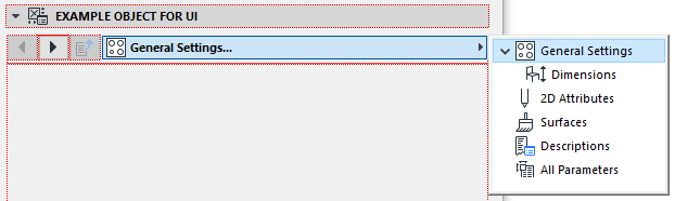
This automatic paging control is placed above the 444 x 266 pixel ui area, so it’s not occupying any precious space from the parameter controls.
The most elegant way to organize your code is to create the tabpage structure with the UI_PAGE commands, and use subroutines to display the content.
The page indexing does not have to be continuous, but that’s the most easy to do with dynamic incrementation.
The page with the smaller index will be higher up in the list, and the indexing order applies only within one level of hierarchy (a child index can be bigger or smaller than the parent index, it’s still going to be a child, but child indexes are sorted the same way among themselves as parent indexes).
Example script:
! set the title of the UI area popup
ui_dialog `Example Object for UI`

! set the parameter "gs_ui_current_page" for actual page display
ui_current_page gs_ui_current_page

! ------------------------------------------------------------------------
! inicialise all possible tabpage IDs
! ------------------------------------------------------------------------

TABID_ROOT = -1

idxTab = 1
TABID_GENERAL = idxTab			: idxTab = idxTab + 1
TABID_DIMENSIONS = idxTab		: idxTab = idxTab + 1
TABID_2DREPRESENTATION = idxTab		: idxTab = idxTab + 1
TABID_3DREPRESENTATION = idxTab		: idxTab = idxTab + 1
TABID_DESCRIPTIONS	= idxTab	: idxTab = idxTab + 1

! ------------------------------------------------------------------------
! Display actual tabpages
! ------------------------------------------------------------------------

ui_page TABID_GENERAL, TABID_ROOT, `General Settings`, "uiTab_Cooktops_hl(1)"
gosub "pageGeneral"

! Dimensions is the child of General Settings
ui_page TABID_DIMENSIONS, TABID_GENERAL, `Dimensions`, "uiTab_Dimension_hl(1)"
gosub "pageDimensions"

ui_page TABID_2DREPRESENTATION, TABID_ROOT, `2D Attributes`, "uiTab_2DRepr_hl(1)"
gosub "page2D"

ui_page TABID_3DREPRESENTATION, TABID_ROOT, `Surfaces`, "uiTab_3DRepr_hl(1)"
gosub "page3D"

ui_page TABID_DESCRIPTIONS, TABID_ROOT, `Descriptions`, "uiTab_Descriptions_hl(1)"
gosub "pageDescriptions"

! ------------------------------------------------------------------------
end
! ------------------------------------------------------------------------

"pageGeneral":
	! page content script

return
.
.
.
! remaining page subroutines
Scripted paging control
If you want to struggle with the tabpage control yourself, or you want to create not supported type of objects, use the short version of the command:
ui_page indexPage
You will still need the “gs_ui_current_page” parameter and every global settings explained above (except Hierarchical pages button), but you also have to define a value list of valid page indexes for the paging parameter in the parameter script, and you have to create an extra ui popup control to display the paging options. Use UI_INFIELD{3} command for that (see below).
This control should be visible on every page (any index, not just static ones), so in addition, you have to place an extra UI_PAGE command just for this control:
! place the following control on every displayed page
ui_page gs_ui_current_page

! control popup for paging
ui_infield{3} "gs_ui_current_page", 0, 0, 180, 25,
	2, "",
	0, 0,
	30, 20, 30, 20,
	"iconName1",	"pageTitle1",	pageIndex1,
	"iconName2",	"pageTitle2",	pageIndex2,
	"iconName3",	"pageTitle3",	pageIndex3

! go to next-previous page buttons
ui_button ui_prev, " >> ", 185,2, 32,21, gs_ui_current_page - 1
ui_button ui_next, " << ", 217,2, 32,21, gs_ui_current_page + 1


Please note, that this method does only support continuous page numbering.
The Library has a built-in function macro for the above purpose, look for examples in Label and Zone objects for “ui_tabcontrol” calling.
User interface items:
- pictures (UI_PICT)
- separator lines (UI_SEPARATOR)
- static texts (UI_OUTFIELD)
- popups,text or picture (UI_INFIELD)
- radiobuttons (UI_RADIOBUTTON)
- infields for parameters (UI_INFIELD)
- checkboxes (UI_INFIELD)
- buttons (UI_BUTTON, UI_PICTBUTTON)
- lists (UI_LISTFIELD, UI_LISTITEM)
- sliders (UI_SLIDER)
- colorpicker popups (UI_COLORPICKER)
When dealing with picture on the UI (either as part of ui_infield, or in ui_pict as static item), make sure the picture is the same size as you want to see it on the UI. ARCHICAD distorts the image if the original sizes and the scripted sizes are different. The used image must be included in the loaded libraries.
To check the options of the commands, examine the GDL Manual’s section of The User Interface Script.
UI_INFIELD variations
One of the commands worth explaining in detail is UI_INFIELD. This is the most commonly used input method for user interactions.
An infield is the representation of one parameter of the object.
The visualization of the command can be many: simple infield, checkbox, picture popup, text popup, picture scroll control, picture button.
If the parameter does not have a value list, the input method is simple infield.
If the parameter has a value list, the other types are available as well.
A boolean parameter can be displayed as a checkbox with method 7.
Usually most infields have a description text. This is created using the UI_OUTFIELD command (see the following examples).
Attribute infields
The pen, fill, surface and line type parameters are displayed with their corresponding control type when represented on the UI with UI_INFIELD. The optional parameters [bracketed in the GDL Reference Guide] are not necessary when dealing with attribute type parameters:
y = 5
dy = 30

ui_outfield `Pen Control`, 5, y, 250-33-5-1, 15
ui_infield "UIExample_B", 250-33, y-4, 33, 19
y = y + dy
ui_outfield `Surface Control`, 5, y, 120, 15
ui_infield "UIExample_D", 125, y-5, 125, 25
y = y + dy
ui_outfield `Fill Control`, 5, y, 120, 15
ui_infield "UIExample_A", 125, y-6, 125, 27
y = y + dy
ui_outfield `Line Type Control`, 5, y, 120, 15
ui_infield "UIExample_C", 125, y-7, 125, 29
y = y + dy
ui_outfield `Profile Type Control`, 5, y, 120, 15
ui_infield "UIExample_E", 125, y-7, 250, 29

Simple infields
The simple infield is usually applied for real, length, angle or text input:
y = 5
dy = 30
ui_outfield `Length Parameter`, 5, y, 150, 15
ui_infield "A", 160, y-4, 85, 19
y = y + dy
ui_outfield `Text Parameter`, 5, y, 120, 15
ui_infield "UIExample_E", 125, y-4, 125, 19

Picture infields
When creating a picture control, every picture represents a value of the parameter displayed.
The image can be referenced with picture_name: a matrix picture with rows_number of rows and images_number of subimages is used. This case, the expression_imagen is the index of the subpicture matched for the parameter value.
The parameter value picture can be referenced one-by-one with separate pictures, separate names as well.
The method results 7 different kind of control form, refer to the GDL Manual for all types.
ui_infield{3} parameterName, x, y, infieldWidth, infieldHeight [,
        method, picture_name,
        images_number, rows_number,
        cell_x, cell_y,
        image_x, image_y,
        expression_image1, text1, value_definition1,
        ...
        expression_imagen, textn, value_definitionn]
To visualize the parameters:

The cell should always be at least as wide as the picture parts.
If you want to insert text below the image, the cell should have the extra space for the text. One line of normal style text occupies 13 pixel vertically. Do the math, and calculate the overall size of the control from these, or use pictures with the right size.
This picture matrix has one rows and 2 subpictures:

If the matrix has more pictures in multiple rows, the reference indexing starts with 1 on the first cell of the first row, and increases from left to right, row-by-row:

UI_BUTTON/UI_PICT_BUTTON
With the help of this command, you can either move between pages (create shortcuts), or make something happen when the user pushes a special button on the interface.
Every button must have a unique ID. When a button is pushed, this ID is filled into the GLOB_UI_BUTTON_ID global variable, and the parameter script runs, similar to when a parameter is set.
Using the unique button ID, button-specific codes can be executed in the parameter script, depending on the type of the button:
- ui_prev: the previous tabpage is displayed
- ui_next: the next tabpage is displayed
- ui_function: the ID global variable is filled, can be used to set parameters (gs_ui_current_page, for example)
- ui_link: the optional parameter of the command can store a link, and the default browser navigates there
Example code (jumpbutton shortcuts on the UI):
! ------------------------------------------------------------
! in UI script
! ------------------------------------------------------------
! button ID is the tabID of Sidelight Page
ui_pict_button ui_function, "", "uiFunctionDoorLeaf_hl(1)", 444-36, 30, 36, 22, -iTabID_Sidelight2 ! Set GLOB_UI_BUTTON_ID

! ------------------------------------------------------------
! in Parameter script
! ------------------------------------------------------------
! if ID is negative (jumpbutton pressed), set active page to button ID
if GLOB_UI_BUTTON_ID < 0 then
	parameters gs_ui_current_page = -GLOB_UI_BUTTON_ID
endif
Of course, the negative button ID zone is only working for this, if you have not used it for something else already.
The jumpbutton with picture looks like this:
