Using the following GDL commands, you can define a custom interface for a Library Part’s Custom Settings panel in the settings dialog box.
If you click the Set as default button in the Library Part editor,
the custom interface will be used by default in the Object’s (Door’s, Window’s, etc.) settings dialog box.
Parameters with custom control are not hidden automatically on the original parameter list,
but they can be hidden manually in the library part editor.
Library part with User Interface (and Parameters list):

Library part with no UI and locked Parameters list:

The origin of the coordinate system is in the top-left corner. Sizes and coordinate values are measured in pixels.
UI_DIALOG
UI_DIALOG title [, size_x, size_y]
Defines the title of the dialog box. The default title is ‘Custom Settings’.
Currently, the size of the available area is fixed at 444 x 296 pixels, and the size_x and size_y parameters are not used.
Restriction: The Interface Script should contain only one UI_DIALOG command.
UI_PAGE
UI_PAGE page_number [, parent_id, page_title [, image]]
Page directive, defines the page that the interface elements are placed on. Default page numbering starts at 1, but any starting number is usable.
If there is no UI_PAGE command in the Interface Script, each element will be displayed on the first page by default.
Moving between pages can be defined in different ways:
- The easiest way is to let do it:
in the object editor, press the “Hierarchical Pages” button in the User Interface Script window, and fill in the optional parameters of the UI_PAGE command.
In this case the page_number of the page selected from the tree is passed to the library part through the “gs_ui_current_page” parameter. No need to set a value list for the paging parameter:
collects and sorts all valid page ID-s from the UI_PAGE command’s parameters by pre-reading the object’s ui script. - Another method is to use two buttons created with the UI_NEXT and UI_PREV commands, placing them on every page to manipulate the value of the “gs_ui_current_page” parameter.
See the UI_BUTTON command for more information. - In case the new hierarchical page setup is not required, to create dynamic page handling, use the the UI_INFIELD{3} command.
Set a value list for “gs_ui_current_page” parameter, and place a popup using its values on every page.
page_number: the page number, a positive integer. Following interface elements are placed on this page.parent_id: positive integer, the parent id of the page. The special value -1 value means root parent. Only evaluated if “Hierarchical Pages” is set.page_title: title string of the page, appears on the top of the page and the tree view popup of the pages. Only evaluated if “Hierarchical Pages” is set.image: file name or index number of a picture stored in the library part. If specified and not empty or 0, this icon associatedto the page is displayed on the top of the page and in tree view popup of the pages, next to the title. Only evaluated if “Hierarchical Pages” is set.
Warning: In the simple way of paging, any break of continuity in the page numbering forces the insertion of a new page without buttons,
and therefore there will be no possibility to go to any other page from there.
This restriction can be circumvented using the UI_CURRENT_PAGE command.
UI_CURRENT_PAGE
UI_CURRENT_PAGE index
Definition of the current tabpage to display.
Warning: Jumping to a non-existent page forces the insertion of a new page without buttons and controls,
and therefore there is no possibility to go to any other page from there.
index: valid index of the UI_PAGE to display.UI_BUTTON
UI_BUTTON type, text, x, y [, width, height, id [, url]]
Button definition on current page. Buttons can be used for various purposes:
moving from page to page, opening a web page or performing some parameter-script defined action.
Buttons can contain text.
type: type of the button as follows:UI_PREV: if pressed, the previous page is displayed,UI_NEXT: if pressed, the next page is displayed,UI_FUNCTION: if pressed, the GLOB_UI_BUTTON_ID global variable is set to the button id specified in expression,UI_LINK: if pressed, the URL in expression is opened in the default web browser,text: the text that should appear on the button.x, y: the position of the button.width, height: width and height of the button in pixels.If not specified (for compatibility reasons) the default values are 60 pixels for width and 20 pixels for height.
id: an integer unique identifier.url: a string containing a URL.UI_PREV and UI_NEXT buttons are disabled if the previous/next page is not present.
If these buttons are pushed, the gs_ui_current_page parameter of the library part is set
to the index of the page to show – if there’s a parameter with this name.
Example:
! UI script
UI_CURRENT_PAGE gs_ui_current_page
UI_BUTTON UI_FUNCTION, "Go to page 9", 200,150, 70,20, 3
UI_BUTTON UI_LINK, "Visit Website", 200,180, 100,20, 0,
        "https://www.graphisoft.com"
! parameter script
if GLOB_UI_BUTTON_ID = 3 then
        parameters gs_ui_current_page = 9, ...
endif
UI_PICT_BUTTON
UI_PICT_BUTTON type, text, picture_reference,
        x, y, width, height [, id [, url]]
Similar to the UI_BUTTON command. But this type of buttons can contain pictures.
picture_reference: file name or index number of the picture stored in the library part.
The index 0 refers to the preview picture of the library part.
Pixel transparency is allowed in the picture.
text: has no effect for picture buttons.
UI_SEPARATOR
UI_SEPARATOR x1, y1, x2, y2
Generates a separator rectangle. The rectangle becomes a single (vertical or horizontal) separator line if x1 = x2 or y1 = y2
x1, y1: upper left node coordinates (starting point coordinates of the line).x2, y2: lower right node coordinates (endpoint coordinates of the line).UI_GROUPBOX
UI_GROUPBOX text, x, y, width, height
A groupbox is a rectangular separator with caption text. It can be used to visually group logically related parameters.
text: the title of the groupbox.x, y: the position of upper left corner.width, height: width and height in pixels.UI_PICT
UI_PICT picture_reference, x, y [, width, height [, mask]]
Picture element in the dialog box. The picture file must be located in one of the loaded libraries.
picture_reference: file name or index number of the picture stored in the library part.
The index 0 refers to the preview picture of the library part.
x, y: position of the top left corner of the picture.width, height: optional width and height in pixels; by default, the picture’s original width and height values will be used.mask: alpha + distortion.See the PICTURE command for full explanation.
UI_STYLE
UI_STYLE fontsize, face_code
All the UI_OUTFIELDs and UI_INFIELDs generated after this keyword will represent this style until the next UI_STYLE statement.
fontsize: one of the following font size values:0: small,1: extra small,2: large.face_code: similar to the DEFINE STYLE command, but the values cannot be used in combination.0: normal,1: bold,2: italic,4: underline.UI_OUTFIELD
UI_OUTFIELD expression, x, y [, width, height [, flags]]
Generates a static text.
expression: numerical or string expression.x, y: position of the text block’s top left corner.width, height: width and height of the text box.If omitted, the text box will wrap around the text as tight as possible for the given font.
flags: flags = j1 + 2*j2 + 4*j3, where each j can be 0 or 1.j1: horizontal alignment (with j2),j2: horizontal alignment (with j1):j1 = 0, j2 = 0: Aligns to the left edge (default),
j1 = 1, j2 = 0: Aligns to the right edge,
j1 = 0, j2 = 1: Aligns to the center,
j1 = 1, j2 = 1: Not used,
j3: grayed text.UI_INFIELD
UI_INFIELD "name", x, y, width, height [,
        method, picture_name,
        images_number,
        rows_number, cell_x, cell_y,
        image_x, image_y,
        expression_image1, text1,
        ...
        expression_imagen, textn]
UI_INFIELD{2}
UI_INFIELD{2} name, x, y, width, height [,
        method, picture_name,
        images_number,
        rows_number, cell_x, cell_y,
        image_x, image_y,
        expression_image1, text1,
        ...
        expression_imagen, textn]
UI_INFIELD{3}
UI_INFIELD{3} name, x, y, width, height [,
        method, picture_name,
        images_number,
        rows_number, cell_x, cell_y,
        image_x, image_y,
        expression_image1, text1, value_definition1,
        ...
        [picIdxArray, textArray, valuesArray,
        ...]
        expression_imagen, textn, value_definitionn]
UI_INFIELD{4}
UI_INFIELD{4} "name", x, y, width, height [,
        method, picture_name,
        images_number,
        rows_number, cell_x, cell_y,
        image_x, image_y,
        expression_image1, text1, value_definition1,
        ...
        [picIdxArray, textArray, valuesArray,
        ...]
        expression_imagen, textn, value_definitionn]
Generates an edit text or a pop-up menu for the parameter input.
A pop-up is generated if the parameter type is value list, material, fill, line type or pencolor.
If the optional parameters of the command are present, value lists can be alternatively displayed as thumbnail view fields.
Different thumbnail control types are available.
They display the specified images and associated texts and allow the selection of one single item at a time, just like in a pop-up menu.
In the version 1 and 2 infield, the thumbnail items and the value list items are associated by indices.
The version 3 and version 4 infield defines value association which binds the thumbnail items to value list items of the associated parameter.
If a value defined in a thumbnail item isn’t present in the parameter’s value list, it won’t be displayed in the control.
Identical sized arrays can be used for lines of definition as well.
The Interface Script is rebuilt with the new value after any parameter is modified.
name: parameter name as string expression for UI_INFIELD and UI_INFIELD{4} or
parameter name with optional actual index values if array for UI_INFIELD{2} and UI_INFIELD{3}.
x, y: the position of the edit text, pop-up or control.width, height: width and height in pixels.method: the type of the control.1: List view control.
2: Popup menu control.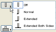
3: Popup icon radio control (arrow overlays picture area).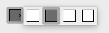
4: Push icon radio control.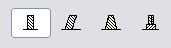
5: Pushbutton with text.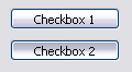
6: Pushbutton with picture.
7: Checkbox with text.
8: Popup list with text.
9: Popup icon radio control (arrow is next to picture area).Compatibility: introduced in ARCHICAD 20.
picture_name: name of the common image file containing a matrix of concatenated images, or empty string.images_number: number of images in the matrix, for boolean parameters it can be 0 or 2.rows_number: number of rows of the matrix.cell_x, cell_y: width and height of a cell within the thumbnail view field, including image and text.image_x, image_y: width and height of the image in the cell.expression_imagei: index of image number i in the matrix, or individual file name.
If a common image file name was specified, indices must be used here.
Combination of indices and individual file names does not work.
texti: text in cell number i.value_definitioni: value definition which matches the cell with a value list item by value:expression: numerical or string expression, orCUSTOM: keyword, meaning that any custom value can be entered.picIdxArray: Dynamic array of picture names (strings) or indexes (integers) in cells. Do not use mixed types in arraytextArray: Dynamic array of texts in cellsvalueArray: Dynamic array of parameter values in cellsExample 1:
! Master script
HOLE_RECTANGULAR = 1
HOLE_CIRCULAR    = 2

! Parameter script
values{2} "iHoleType", HOLE_RECTANGULAR, `Rectangular`,
			HOLE_CIRCULAR, `Circular`

! UI script
ui_style 0, 1
ui_infield{3} "bShowHole", 15, 10, 180, 19,
				7, "",
				0, 0,
				0, 0, 0, 0,
				"", `Show Hole`, 0,
				"", `Show Hole`, 1
ui_style 0, 0

if bShowHole then
    ui_dialog `Hole Definition Parameters`
    ui_outfield `Type of Hole`, 15, 40, 180, 15
    ui_infield{3} "iHoleType", 190, 40, 105, 19,
				8, "",
				0, 0,
				0, 0, 0, 0,
				"", `Rectangular`, HOLE_RECTANGULAR,
				"", `Circular`, HOLE_CIRCULAR

    if iHoleType = HOLE_RECTANGULAR then
        ui_pict "9738", 110, 65, 42, 23, 1

        ui_outfield `Hole Width`, 15, 70, 180, 15
        ui_infield "E", 190, 70, 105, 19

        ui_outfield `Hole Height`, 15, 100, 180, 15
        ui_infield "F", 190, 100, 105, 19

        ui_outfield `Distance between Holes`, 15, 130, 180, 15
        ui_infield "G", 190, 130, 105, 19
    else
        ui_pict "9735", 110, 65, 42, 23, 1

        ui_outfield `Hole Diameter`,15, 70, 180, 15
        ui_infield "J", 190, 70, 105, 19

        ui_outfield `Hole Centers Distance`, 15, 100, 180, 15
        ui_infield "K", 190, 100, 105, 19

        ui_outfield `Hole Circle Resolution`, 15, 130, 180, 15
        ui_infield "M", 190, 130, 105, 19
    endif
    ui_outfield `Number of Holes`, 15, 160, 180, 15
    ui_infield "I", 190, 160, 105, 19
endif
ui_separator 0, 195, 444, 195
ui_outfield `Beam Surface`, 15, 210, 180, 15
ui_infield "matBeam", 190, 210, 105, 23
ui_outfield `Beam Pen`, 15, 240, 180, 15
ui_infield "penBeam", 190, 240, 33, 19


Example 2:
! Parameter Script:
VALUES "myParameter" "Two", "Three", "Five", CUSTOM

! Interface Script:
px = 80
py = 60
cx = px + 3
cy = py + 25

UI_INFIELD{3} "myParameter", 10, 10, 4 * cx + 21, cy + 5,
        1, "myPicture", 6,
        1, cx, cy, px, py,
        1, "1 - one", "One",
        2, "2 - two", "Two",
        3, "3 - three", "Three",
        4, "4 - four", "Four",
        5, "5 - five", "Five",
        6, "custom value", CUSTOM
Example 3:
! Parameter Script:
VALUES "myParameter" "Two", "Three", "Five", CUSTOM

! Interface Script:
px = 80
py = 60
cx = px + 3
cy = py + 25

paramNameVar = "myParameter"
UI_INFIELD{4} paramNameVar, 10, 10, 4 * cx + 21, cy + 5,
        1, "myPicture", 6,
        1, cx, cy, px, py,
        1, "1 - one", "One",
        2, "2 - two", "Two",
        3, "3 - three", "Three",
        4, "4 - four", "Four",
        5, "5 - five", "Five",
        6, "custom value", CUSTOM
Example 4:
! Master Script
dim picIdxValuesUI[]
dim textValuesUI[]
dim parameterValues[]

if myTypeParameter = 1 then
    picIdxValuesUI[1] = 6
    picIdxValuesUI[2] = 7
    picIdxValuesUI[3] = 8

    textValuesUI[1] = "6 - six"
    textValuesUI[2] = "7 - seven"
    textValuesUI[3] = "8 - eight"

    parameterValues[1] = "Six"
    parameterValues[2] = "Seven"
    parameterValues[3] = "Eight"
else
    picIdxValuesUI[1] = 6
    picIdxValuesUI[2] = 7

    textValuesUI[1] = "6 - six"
    textValuesUI[2] = "7 - seven"

    parameterValues[1] = "Six"
    parameterValues[2] = "Seven"
endif
! Parameter Script:
VALUES "myTypeParameter" 1, 2
VALUES "myStringParameter" "Two", "Three", "Five", parameterValues, CUSTOM

! Interface Script:
px = 80
py = 60
cx = px + 3
cy = py + 25

paramNameVar = "myStringParameter"
UI_INFIELD{4} paramNameVar, 10, 10, 4 * cx + 21, cy + 5,
        1, "myPicture", 6,
        1, cx, cy, px, py,
        1, "1 - one", "One",
        2, "2 - two", "Two",
        3, "3 - three", "Three",
        4, "4 - four", "Four",
        5, "5 - five", "Five",
        picIdxValuesUI, textValuesUI, parameterValues,
        9, "custom value", CUSTOM
UI_CUSTOM_POPUP_INFIELD
UI_CUSTOM_POPUP_INFIELD "name", x, y, width, height,
        storeHiddenId, treeDepth,
        groupingMethod, selectedValDescription
        value1, value2, valuesArray1, .... valuen, valuesArrayn
UI_CUSTOM_POPUP_INFIELD{2}
Compatibility: introduced in ARCHICAD 20.
UI_CUSTOM_POPUP_INFIELD{2} name, x, y, width, height,
        storeHiddenId, treeDepth,
        groupingMethod, selectedValDescription
        value1, value2, valuesArray1, .... valuen, valuesArrayn
Generates a popup for a value list of a parameter defined in the User Interface script to avoid using the Parameter script. Suitable for lists which can not be requested in Parameter script. For the parameter script restrictions see the REQUEST Options.
name: parameter name as string expression for UI_CUSTOM_POPUP_INFIELD or parameter name with optional actual index values if array for UI_CUSTOM_POPUP_INFIELD{2}.x, y: the position of the edit text, pop-up.width, height: width and height in pixels.storeHiddenId, treeDepth: to set up automatic or manual trees.storeHiddenId = 0, treeDepth = 0: works only with array parameters.The “treeDepth” parameter is set automatically by the second dimension (number of columns) of the array.
storeHiddenId = 1, treeDepth > 0: works only with single parameters.There must be n * (1 + treeDepth) values defined (first one for the stored ID and the rest for defining the custom tree).
groupingMethod: grouping method for sorting the tree.1: does not sort the groups and values under the same parent.
2:
sorts the groups and values under the same parent.

selectedValDescription: the text written in the field, if empty string the text will be the stored ID of the selected item.valuei, valuesArrayi: define tree values one-by-one and/or with a one dimension array.
Example:
UI_CUSTOM_POPUP_INFIELD "stParameterName", x, y, width, height,
    1, 3, 2, "",    ! storeHiddenId, treeDepth, groupingMethod, selectedValDescription
    "hiddenID1",    "type1",    "group1",   "value1",
    "hiddenID2",    "type1",    "group1",   "value2",
    "hiddenID3",    "type2",    "group2",   "value1",
    "hiddenID4",    "type2",    "group2",   "value2",
    "hiddenID5",    "type2",    "",         "value3",
    "hiddenID6",    "",         "",         "value4",
    "hiddenID7",    "",         "",         "value5",

UI_RADIOBUTTON
UI_RADIOBUTTON name, value, text, x, y, width, height
UI_RADIOBUTTON{2}
Compatibility: introduced in ARCHICAD 20.
UI_RADIOBUTTON{2} "name", value, text, x, y, width, height
Generates a radio button of a radio button group. Radio button groups are defined by the parameter name.
Items in the same group are mutually exclusive.
name: parameter name as string expression for UI_RADIOBUTTON{2} or parameter name with optional actual index values if array for UI_RADIOBUTTON.value: parameter is set to this value if this radio button is set.text: this text is displayed beside the radio button.x, y: the position of the radio control.width, height: width and height in pixels.
Example:
UI_RADIOBUTTON "ceilingPlan", 0, `Floor Plan`, 10, 140, 100, 20
UI_RADIOBUTTON "ceilingPlan", 1, `Ceiling Plan`, 10, 160, 100, 20

UI_PICT_RADIOBUTTON
UI_PICT_RADIOBUTTON name, value, text,
	picture_reference, x, y, width, height [UI_TOOLTIP tooltip]
UI_PICT_RADIOBUTTON{2}
UI_PICT_RADIOBUTTON{2} "name", value, text,
	picture_reference, x, y, width, height [UI_TOOLTIP tooltip]
Compatibility: introduced in ARCHICAD 22.
Generates one radio button with icon of a radio button group. Radio button groups are defined by the parameter name.
Items in the same group are mutually exclusive.
name: parameter name or name as string expression for UI_PICT_RADIOBUTTON and parameter name as string expression (or text array indexed value) for UI_PICT_RADIOBUTTON{2}.value: parameter is set to this value if this radio button is set.text: this text is displayed on the button if no image is declared.picture_reference: file name or index number of the picture stored in the library part. The index 0 refers to the preview picture of the library part. Pixel transparency is allowed in the picture.x, y: the position of the radio control (top left anchor).width, height: width and height of the button in pixels. Image size is not declared individually: it should fit the button, as image is not stretched automatically to fit, and is centered on the button.UI_PICT_PUSHCHECKBUTTON
UI_PICT_PUSHCHECKBUTTON name, text, picture_reference,
	frameFlag, x, y, width, height [UI_TOOLTIP tooltip]
UI_PICT_PUSHCHECKBUTTON{2}
UI_PICT_PUSHCHECKBUTTON{2} "name", text, picture_reference,
	frameFlag, x, y, width, height [UI_TOOLTIP tooltip]
Compatibility: introduced in ARCHICAD 22.
Generates one pushcheck button with icon for a boolean parameter. Similar to UI_INFIELD{3} command with method 6, with additional option to control the visibility of the button frame.
name: parameter name or name as string expression for UI_PICT_PUSHCHECKBUTTON and parameter name as string expression (or text array indexed value) for UI_PICT_PUSHCHECKBUTTON{2}.text: this text is displayed on the button if no image is declared.picture_reference: file name or index number of the picture stored in the library part. The index 0 refers to the preview picture of the library part. Pixel transparency is allowed in the picture.frameFlag: 1 – frame is displayed, 0 – frame is not visible. Use this option to match the control to other User Interface items in style.x, y: the position of the radio control (top left anchor).width, height: width and height of the button in pixels. Image size is not declared individually: it should fit the button, as image is not stretched automatically to fit, and is centered on the button.UI_TEXTSTYLE_INFIELD
UI_TEXTSTYLE_INFIELD name, faceCodeMask, x, y,
	buttonWidth, buttonHeight[, buttonOffsetX]
UI_TEXTSTYLE_INFIELD{2}
UI_TEXTSTYLE_INFIELD{2} "name", faceCodeMask, x, y,
	buttonWidth, buttonHeight[, buttonOffsetX]
Compatibility: introduced in ARCHICAD 22.
Generates a row of puschcheckbuttons specifically used to set font style via an integer parameter, with similar appearance as seen in the general program interface. The format of the set value matches the input parameter of the DEFINE STYLE command. Both icons and tooltips are referenced from ARCHICAD itself, according to the localized version. The enabled buttons are displayed in a single-row arrangement.
name: parameter name or name as string expression for UI_TEXTSTYLE_INFIELD and parameter name as string expression (or text array indexed value) for UI_TEXTSTYLE_INFIELD{2}.faceCodeMask: this text is displayed on the button if no image is declared.j1: bold,j2: italic,j3: underline,j6: superscript,j7: subscript,j8: strikethrough.If faceCodeMask = 0, then all possible font style buttons are displayed. In case of an invalid faceCodeMask, “Check Script” returns with warning (“Invalid mask value used”).
x, y: the position of the radio control (top left anchor).buttonWidth, buttonHeight: width and height of one button in pixels. Full width can be calculated by using the faceCodeMask, the buttonWidth and the buttonOffsetX values, if necessary.buttonOffsetX: distance between neighboring buttons in the row, in pixels. Automatic, if not set.UI_LISTFIELD
UI_LISTFIELD fieldID, x, y, width, height [, iconFlag [, description_header [, value_header]]]
Generates a control for the parameter input as a scrollable list containing an arbitrary number of rows, with the following columns:
icon, description and input field for the parameter value.
Lines of the list can be defined with the UI_LISTITEM command. UI_LISTFIELD and UI_LISTITEM definitions can be scripted in an arbitrary order.
Empty listfields (with no list items) are not displayed.
fieldID: the unique identifier of the listfield. This ID also used in the UI_LISTITEM commands specifies the listfield the listitems belong to.
Duplicates within a user interface script are not allowed.
x, y: position of the listfield’s top left corner.
width, height: width and height in pixels.
iconFlag: iconFlag = 0: icon column is not generated for this listfield.
iconFlag = 1: icon column is generated for this listfield (default value if not specified).
If the Custom Settings panel has only one control and this control is a listfield, the x, y, width, height parameters have no effect.
In this case the width of the listfield equals to the width of the Custom Settings panel.
description_header: the title of the Description column.
value_header: the title of the Value column.
If both description_header and value_header are empty strings or not specified, the listfield is generated without a header.
If the strings contain at least one space, the listfield is generated with an empty header.
UI_LISTITEM
UI_LISTITEM itemID, fieldID, "name" [, childFlag [, image [, paramDesc]]]
UI_LISTITEM{2}
UI_LISTITEM{2} itemID, fieldID, name [, childFlag [, image [, paramDesc]]]
Appends a listitem to the listfield defined by the fieldID parameter.
itemID: the unique identifier of the listitem. Listitems can be scripted in an arbitrary order and are sorted by itemID.
Duplicate listitem IDs within a listfield are not allowed.
fieldID: the unique identifier of the listfield containing this listitem.
name: parameter name as string expression for UI_LISTITEM or parameter name with optional actual index values if array for UI_LISTITEM{2}.
childFlag: childFlag = 0: the listitem is a groupitem (default value if not specified).
childFlag = 1: the listitem is a childitem. The parent item is the first groupitem above.
image: file name or index number of the picture stored in the library part.
If valid, it is displayed as an icon in the first column of the listfield in the associated listitem’s row.
paramDesc: the visible name of the listitem in the Description column.
If left empty, the description is automatically filled up from the parameter list description of the Library Part.
If there is no description there, the name of the parameter is displayed instead.
If “name” string is empty, the listitem is a group with bold fonttype.
If both “name” string and paramDesc are empty, the listitem is a separator.
The HIDEPARAMETER command is ineffective for list items, the script should not add the item instead of using it.
The LOCK command can be used and it is effective for list items.
For a listfield it is recommended to define different itemIDs for different parameters, groups and separators.
Example:
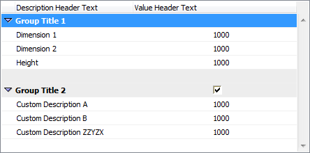
! List with header without icon column

ui_listfield 1, 10, 35, 432, 220, 0, "Description Header Text", "Value Header Text"

ui_listitem 1, 1, "", 0, "", "Group Title 1" ! Group Line
ui_listitem 2, 1, "A", 1
ui_listitem 3, 1, "B", 1
ui_listitem 4, 1, "ZZYZX", 1

ui_listitem 5, 1, "" !separator
ui_listitem 6, 1, "AC_show2DHotspotsIn3D", 0, "", "Group Title 2" ! Group Parameter Line
ui_listitem 7, 1, "A", 1, "", "Custom Description A"
ui_listitem 8, 1, "B", 1, "", "Custom Description B"
ui_listitem 9, 1, "ZZYZX", 1, "", "Custom Description ZZYZX"
UI_CUSTOM_POPUP_LISTITEM
UI_CUSTOM_POPUP_LISTITEM itemID, fieldID, "name", childFlag, image, paramDesc,
        storeHiddenId, treeDepth,
        groupingMethod, selectedValDescription
        value1, value2, valuesArray1, .... valuen, valuesArrayn
UI_CUSTOM_POPUP_LISTITEM{2}
Compatibility: introduced in ARCHICAD 20.
UI_CUSTOM_POPUP_LISTITEM{2} itemID, fieldID, "name", childFlag, image, paramDesc,
        storeHiddenId, treeDepth,
        groupingMethod, selectedValDescription
        value1, value2, valuesArray1, .... valuen, valuesArrayn
Similar to the UI_CUSTOM_POPUP_INFIELD and the UI_CUSTOM_POPUP_INFIELD{2}.
Generates a listitem with popup for a value list of a parameter defined in the User Interface script to avoid using the Parameter script. For the parameter script restrictions see the REQUEST Options.
itemID: the unique identifier of the listitem. Listitems can be scripted in an arbitrary order and are sorted by itemID. Duplicate listitem IDs within a listfield are not allowed.fieldID: the unique identifier of the listfield containing this listitem.name: parameter name as string expression for UI_CUSTOM_POPUP_LISTITEM or parameter name with optional actual index values if array for UI_CUSTOM_POPUP_LISTITEM{2}.childFlag: childFlag = 0: the listitem is a groupitem (default value if not specified).childFlag = 1: the listitem is a childitem. The parent item is the first groupitem above.image: ile name or index number of the picture stored in the library part. If valid, it is displayed as an icon in the first column of the listfield in the associated listitem’s row.paramDesc: the visible name of the listitem in the Description column. If left empty, the description is automatically filled up from the parameter list description of the Library Part. If there is no description there, the name of the parameter is displayed instead.storeHiddenId, treeDepth: to set up automatic or manual trees.storeHiddenId = 0, treeDepth = 0: works only with array parameters.The “treeDepth” parameter is set automatically by the second dimension (number of columns) of the array.
storeHiddenId = 1, treeDepth > 0: works only with single parameters.There must be n * (1 + treeDepth) values defined (first one for the stored ID and the rest for defining the custom tree).
groupingMethod: grouping method for sorting the tree.1: does not sort the groups and values under the same parent.2: sorts the groups and values under the same parent.
selectedValDescription: the text written in the field, if empty string the text will be the stored ID of the selected item.valuei, valuesArrayi: define tree values one-by-one and/or with a one dimension array.
Example:
UI_CUSTOM_POPUP_LISTITEM itemID, fieldID, "stParameterName", 0, "", "",
    1, 3, 2, "",    ! storeHiddenId, treeDepth, groupingMethod, selectedValDescription
    "hiddenID1",    "type1",    "group1",   "value1",
    "hiddenID2",    "type1",    "group1",   "value2",
    "hiddenID3",    "type2",    "group2",   "value1",
    "hiddenID4",    "type2",    "group2",   "value2",
    "hiddenID5",    "type2",    "",         "value3",
    "hiddenID6",    "",         "",         "value4",
    "hiddenID7",    "",         "",         "value5",
UI_TOOLTIP
UI_BUTTON type, text, x, y, width, height [, id [, url]] [ UI_TOOLTIP tooltiptext ]
UI_PICT_BUTTON type, text, picture_reference,
        x, y, width, height [, id [, url]] [ UI_TOOLTIP tooltiptext ]
UI_INFIELD "name", x, y, width, height [, extra parameters ... ]
        [ UI_TOOLTIP tooltiptext ]
UI_INFIELD{2} name, x, y, width, height [, extra parameters ... ]
        [ UI_TOOLTIP tooltiptext ]
UI_INFIELD{3} name, x, y, width, height [, extra parameters ... ]
        [ UI_TOOLTIP tooltiptext ]
UI_INFIELD{4} "name", x, y, width, height [, extra parameters ... ]
        [ UI_TOOLTIP tooltiptext ]
UI_RADIOBUTTON name, value, text, x, y, width, height [ UI_TOOLTIP tooltiptext ]
UI_OUTFIELD expression, x, y, width, height [, flags] [ UI_TOOLTIP tooltiptext ]
UI_PICT expression, x, y [, width, height [, mask]] [ UI_TOOLTIP tooltiptext ]
UI_LISTFIELD fieldID, x, y, width, height [, iconFlag [, description_header [, value_header]]]
        [ UI_TOOLTIP tooltiptext ]
UI_LISTITEM itemID, fieldID, "name" [, childFlag [, image [, paramDesc]]]
        [ UI_TOOLTIP tooltiptext ]
UI_LISTITEM{2} itemID, fieldID, "name" [, childFlag [, image [, paramDesc]]]
        [ UI_TOOLTIP tooltiptext ]
Defines the tooltip for the control on the user interface page.
Tooltips are available for buttons, infields, outfields, listfields, listitems and pictures
if they are not disabled by the user in the running context (e.g., in the Help menu of ).
The listfield’s tooltip appears in all included listitems if an item has none declared.
The own tooltip of the listitem will take effect over the tooltip of the listfield (if existing) inline.
tooltiptext: the text to display as tooltip for the control.UI_COLORPICKER
UI_COLORPICKER "redParamName", "greenParamName", "blueParamName", x0, y0 [, width [, height]]
UI_COLORPICKER{2}
UI_COLORPICKER{2} redParamName, greenParamName, blueParamName, x0, y0 [, width [, height]]
Color picker dialog to set the r, g, b components of a color and store them into the given parameters. These values can later be used in the LIGHT command.
redParamName, greenParamName, blueParamName: parameter names as string expression for UI_COLORPICKER or parameter names with optional actual index values if array for UI_COLORPICKER{2}
x0, y0: position of the color picker’s top left corner.
width, height: width and height in pixels.
UI_SLIDER
UI_SLIDER "name", x0, y0, width, height [, nSegments [, sliderStyle]]
UI_SLIDER{2}
UI_SLIDER{2} name, x0, y0, width, height [, nSegments [, sliderStyle]]
Generates a slider control for an integer parameter defined with a range.
For integer parameters with undefined range lower and upper limit values are -32768 (minimum signed short) and 32767 (maximum signed short).
name: parameter name as string expression parameter or name with optional actual index values for UI_SLIDER{2}.x0, y0: position of the slider.width, height: slider width and height in pixels. If the width > height the slider is horizontal, in the opposite caseit is vertical.
nSegments: optional number of segments on the slider. If 0, no segments are displayed, if omitted or negative, the numberof segments are calculated from the range upper and lower limit values and the step defined for the parameter.
sliderStyle: optional slider style (default is 0)0: slider points to the bottom (horizontal sliders) or to the right (vertical sliders).1: slider points to the top (horizontal sliders) or to the left (vertical sliders).